Santiago Ariel Chaparro
Contrast
Netflix
www.netflix.com/ar-en/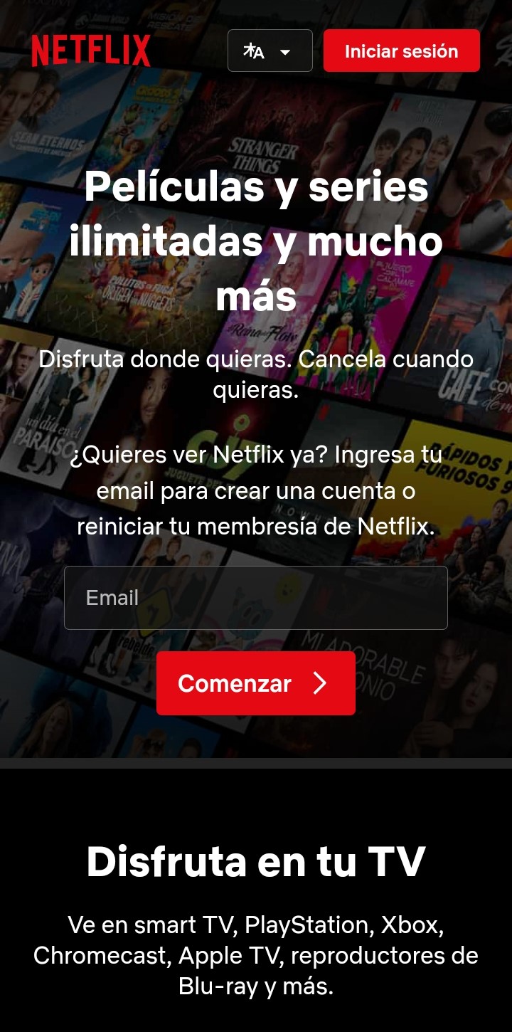
With a dark background and a bright font, the contrast in this website makes it clearly readable and comfortable to the eye.
Visual Hierarchy
Mercado Libre
www.mercadolibre.com.ar/
In this website we can see how the contrast and the page distribution draw the attention of the visitor to what it is trying to show first.
Rule of Thirds
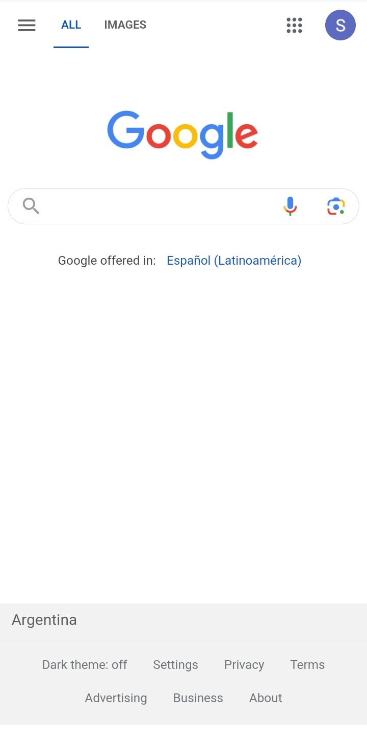
Using the rule of thirds, with a colored font in the middle and white space around, this website tries to draw the attention to the search box.